
For years Pam has been anchored in their iconic red and yellow color scheme and messaging of no residue, no stick, and no mess. That’s a lot of “No” from a brand that really means “yes.”
PAM Before:
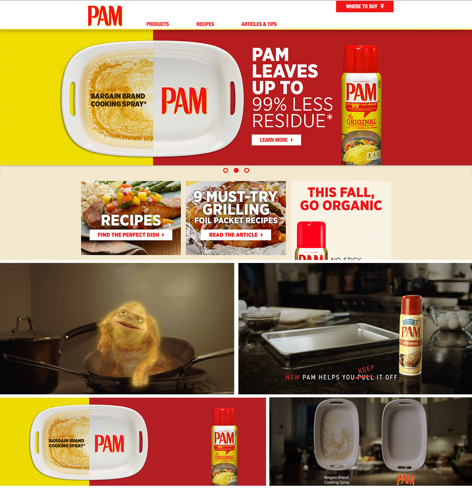
Pam After:

Someone once told me “If you can read, you can cook.” We took that advice and applied to Pam - the "can do" in a can. that means, No matter the recipe, pam is your little shot of confidence in the kitchen.
The undertaking was a total overhaul of all of Pam's communications including redesigning the website, print, dynamic digital displays for micro-segmentation, developing a new social voice and presence, quick turn video content, and a partnership with the Swedish Chef.


“Pam Cooking Spray”
ROLE: Art Director
ACD: Tor Kologlu
ACD: Justin Stielow
Creative Director: Kevin Thomson
Agency: DDB San Francisco
Director: Joel Hopper